![]() I find it extremely important to document the things I learn on my coding journey. It has saved my (coding) life many times before. I do such documentations in form of websites which allows me to refer to my notes from any device in the world.
I find it extremely important to document the things I learn on my coding journey. It has saved my (coding) life many times before. I do such documentations in form of websites which allows me to refer to my notes from any device in the world.
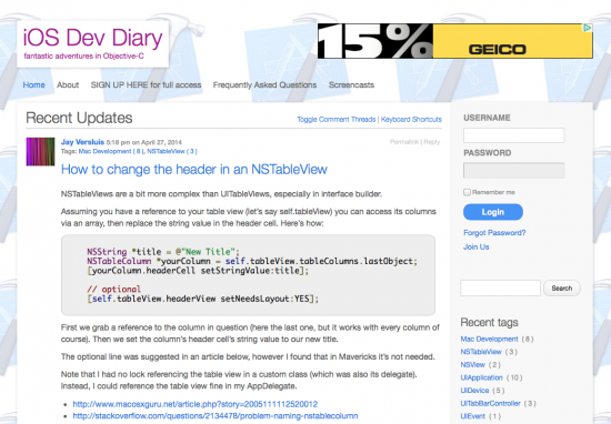
One of those sites is my iOS Dev Diary.
It’s on a spare domain I had lying around that wasn’t doing anything, and when I started adding notes to to the site in 2011 I hadn’t intended it to be a public facing project: I would usually add links to my other sites, add social widgets and make sure the site looks nice so that it makes for a pleasant reading experience.
I dispensed with all that for my iOS notes. I didn’t event pay attention to the traffic it was getting – because seriously: who would read scattered notes and ultra geeky code snippets without a context?
Turns out I was in for a surprise.
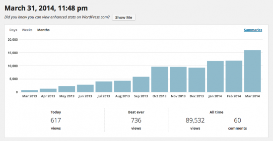
One day I tried some CSS tweaks and installed Jetpack so that I could easily apply additional CSS styles without the need for a Child Theme. Jetpack also counts the daily visitor traffic which was about 20 users per day when I installed it in March 2013, not including my own visits.
You can imagine my surprise when I saw that the traffic was steadily increasing to a point that impacted the server the site was hosted on. Today I’m getting nearly 700 hits per day on that site (!), a little less less at weekends, accounting for a whopping 15k visitors per month.
Luckily I’m in charge of the server that’s hosting my iOS Dev Diary, so I could use it as a test case for high traffic, and to see how different servers would cope with the load: I tried moving the site to a small Amazon AWS instance running Plesk on CentOS – which promptly crumbled under the load. I increased the power of that instance gradually and found that only a C3 Extra Large instance would hold out – not really an option considering its $300 per month price tag.
Other dedicated servers are more cost efficient, and currently the site is hosted on a dedicated machine at Strato which copes very well. The test provided me with valuable insights on many levels, but at the same time it poses a problem: I still need a place for my notes, and I’m happy for others to use them too. But without locking the site down to “private” I’m still stuck with a lot of traffic and therefore quite a bit of hungry infrastructure overhead.
Unless I find a way to subsidise the cost – which leads me to another exciting adventure: turning my iOS Dev Diary into a paid Membership Site.
Thanks to a couple of WordPress plugins I can partially protect content and ask visitors to join the site for a small fee.
Access is granted instantly after the system processes the payment. The membership protection is live since the beginning of the month and meant quite a bit of work and restructuring for Julia and me. Let me tell you more about the project.
The Website
The site is built on WordPress and the amazing P2 Theme by Automattic. It allows me to post directly from the front page which gives it more of a notebook feel. I also use a widget that allows me to login from the front page so I never have to deal with the WordPress admin interface – it’s called Sidebar Login by Mike Jolley.
I didn’t make many alterations to P2, apart from increasing the overall text size which I thought was a bit small. I’ve also increased the padding above h3 tags so that headlines inside a post set themselves apart from the next paragraph.
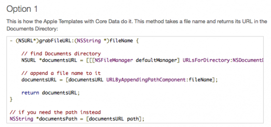
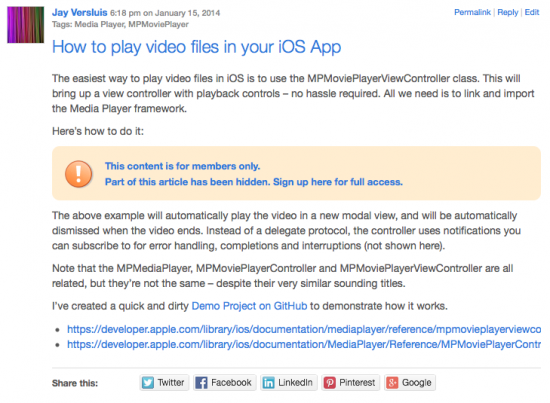
Since the site features a lot of code snippets I’m using the wonderful WP Code Highlight plugin by BoLiQuan which adds code highlighting to pre tags. By default it doesn’t look as prominent as I would have liked, so I applied some styling to make it look much snazzier:
I’ve also written a plugin specifically for P2 which adds a small advertising block to the top of the header – it’s called P2 Header Ad and it works with or without a custom header image. When a user is logged in (i.e. me) then the advert is not shown.
In that form the site is literally an exact copy of my other notebook site on WordPress, Linux, Plesk and all kinds of other code – The WP Guru.
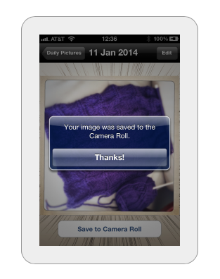
I made one other change to the way centred images are displayed: to make them stand out more, and to make them look like they appear on an iOS device, I’ve added a large white rounded border around them, like this:
Protecting Content
Content protection is one of the most difficult things to get right. Even though it seems to be a simple act of “don’t show this when the user isn’t logged in”, the act of signing up and linking a payment to a certain member isn’t an easy task under the hood.
The system needs to be able to
- process payments and let members register
- tie a payment to the right member
- make the subscription expire when the time comes
- send advance notification emails to users before this happens
- partially protect content for non-members
- do not protect content for logged in members
I’ve looked into countless solutions over the years, and the one I keep coming back to is a suite of plugins from Tips and Tricks HQ:
These are mature products that have been around for many years and are very well supported by the developers. They work out of the box, but they can be tricky to setup due to the myriads of options both plugins allow you to setup.
Styling the plugins is another matter: out of the box they try to apply a mixture of your theme’s styling, plus a few extra bits (such as the shopping cart, Buy Now buttons, the “content is protected” message and so forth) – but there’s nothing a good bit of CSS styling couldn’t fix.
It was important for me not to touch any of the core plugin files: it’s tempting to change text directly when the PHP is called, but plugins don’t have the luxury of Child Themes: when a new version comes out, all my hard work would be eradicated – which is not an option.
If there’s one thing I wish WordPress would have it’s something like Child Plugins – for this very purpose: customising existing plugins without hacking core files.
Instead I made all changes – even text changes – in CSS using pseudo selectors. One example is the “protected content” message above which originally only featured a single line of text. But thanks to CSS3 I could append something else, or even replace the text altogether.
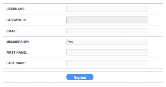
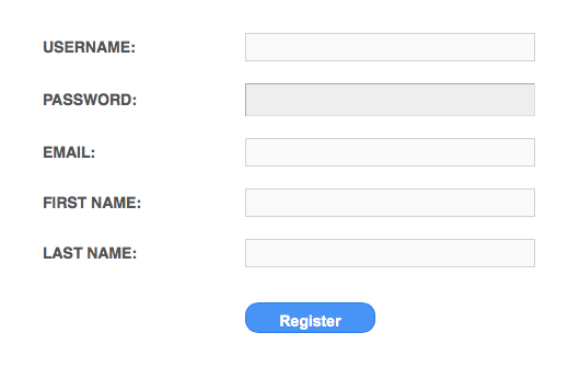
Another example was the registration dialogue: it was showing the user’s membership level (i.e. Free Membership) even though he hadn’t quite picked one yet. It was confusing and irrelevant information and could not be changed. Thanks to CSS3’s nth-child selector I simply suppressed the output of the 4th line in the table – and gone was the option I didn’t want to be displayed.
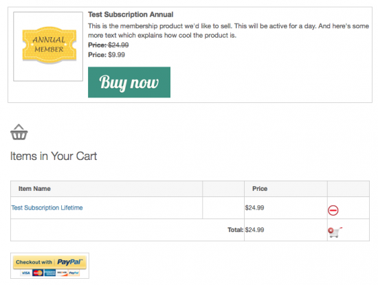
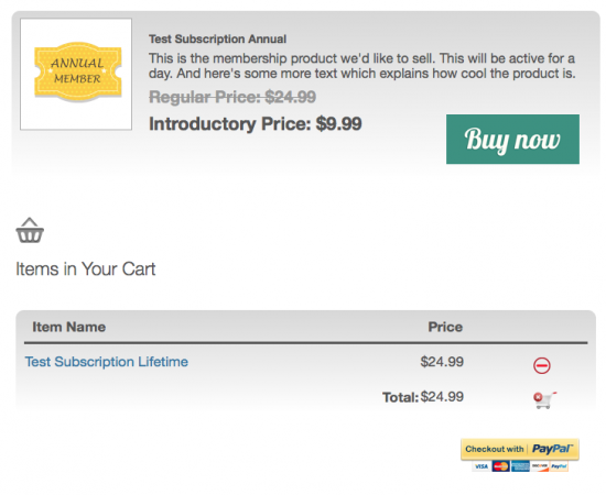
The Buy Now buttons and Shopping Cart were another case for CSS:
Two online tools that deserve a mention here are:
- The Ultimate CSS Border Radius Generator by Jacob Bijani
- CSS Gradient Generator by Colorzilla
These tools let you dial in the look and feel you want, and then give you cross-browser CSS to copy and paste. Toys I don’t want to live without!
The new features are live since the beginning of April, and the signups are rolling in. Every new member helps to feed the hungry server – and encourages me enormously to keep going with the project.
Thanks for your support!
– iOS Dev Diary – fantastic adventures in Objective C