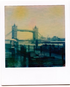
Impossible have recently released their very first batch of Colour Material called PX 70 Color Shade.
This First Flush stock is currently available as a starter pack of 3x 8 shots for £34. At £1.40 per shot, that’s 70p cheaper than the £2.10 we’re currently paying for one PX 600 black and white picture. That’s great news!
However, as is always the case with colour over black and white, there’s a LOT more happening chemically. Where the PX 100 and 600 materials already had to deal with 4 internal layers, the PX 70 new colour material has at least 15, maybe even more.
Let’s see what the Impossible Team have cooked up for us. For this test, I’ve tried PX 70 in my new Golden SX-70.
Triple Pack
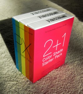 I feel reminded of the Grand Theft Auto Triple Pack when the stock arrived a couple of weeks ago. The three packages are held together by an outer sleeve, which may or may not have been designed by Paul Giambarba. Let me know if that’s your handwriting on those PX boxes 😉
The sleeve gives you directions on how to treat the film when it comes out of the camera. No news here – it’s still sensitive to light right after exposure for up to two minutes. The first 10 seconds are crucial.
You’ll also find these lovely words on the sleeve – like a personal message to the users of the first hour:
These 3 packs of shining instant color film in your hands are simply a miracle. It is hard to believe that we really made it possible – with the help of our friends, customers and all the supporters who believe strongly in the Impossible Project. We did our best to develop, produce and test this material with all our love and understanding. Nevertheless we are now dependent on your honest feedback, support, creativity, understanding and all your analogue passion to continuously improve it.
The single packets look just like PX 100/600, the only difference being colour stripes on the outside instead of grey ones. Nice touch.
You can watch Mijonju do a Live Unboxing here. He’ll also take a picture there and then. Check it out.
New Film – New Chemicals
Ilford are responsible for the PX100/600 chemicals, but as you may know they were never into colour films or chemicals. Hence Impossible had to find a new partner: InovisCoat.
 I’ve you’ve been around film and processing as long as I have, you know the companies in the industry. Trust me: InovisCoat isn’t one of them. I’ve never heard of them, nor have many on the internet. Their website is a tad sketchy so I’m not sure if this is an old company with a new name or an industry newcomer. Either way, welcome to the Impossible Challenge 😉
On the Surface
The actual film pack is the same as before, albeit with a blue sticker on the front so if you ever need to unload your camera in a changing bag, you can still tell the black and white from the colour. Nice touch! I did this to take some pictures with two of my cameras. Re-inserting the dark slide is a piece of cake.
The actual pictures are a little bit different though: we now have a shiny backside instead of a matte one we knew from PX 100/600. The picture feels a bit heavier too but that may well be my imagination. Also on the back we find a 9 digit batch number and the inscription IMPOSSIBLE CR (just like traditional Polaroids used to have).
I’m a bit concerned about a horizontal scratch that seems to go through the front of every picture in my triple pack. Surely this isn’t supposed to be there…
Let’s see some pictures
I eagerly fed a new pack into my Golden SX-70 which I had never tested before. Looks like the same blue activation paste is used as in the other PX films.
I turned my picture over and waited… even if it’s VERY tempting to have a quick look! But when these two pictures came out I wasn’t sure if that’s the camera or the film material.
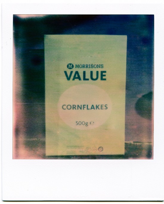
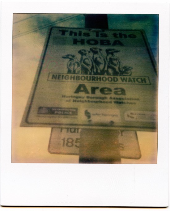
I quickly changed the film pack into my 600 camera and took a few more to see if it’s my camera – but it isn’t: the characteristics are the same.
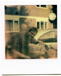
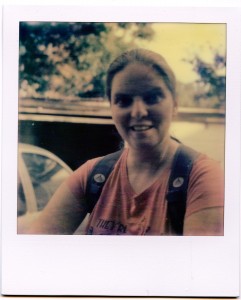
Over the next few days, I’ve taken my SX-70 along with me around town and took some random shots scattered throughout this article. It strikes me that – like on previous occasions – the scanned images look much better than the actual pictures. I’m using an Epson V750 with a rather clever colour correction software called Silverlight AI.
This brings up an interesting question: in this day and age it may be more important to have a material that produces good scan results rather than one that looks pleasing to the human eye. Maybe Impossible will need to produce two materials: one that produces a good looking instant picture for framing, and another one that looks really dull but bears the characteristics of a large format positive that produces good results once it’s scanned.
Kodak have been through a similar process years ago with their motion picture negatives: material made immediate transfer to tape for a TV series doesn’t look good when it’s printed to film, but it can be graded much better on a telecine.
Reactions to Temperature
I love what a hot cup of coffee can do to PX 600 pictures when you put it on the backside during development. It looks like the PX 70 doesn’t care about temperature very much as this highly artistic Halloween still life shows.
Right after I took the shot, I placed a hot cup of coffee on the back. PX 600 would produce an orange ring – PX 70 doesn’t even show a trace. I’m talking boiling hot coffee you know.
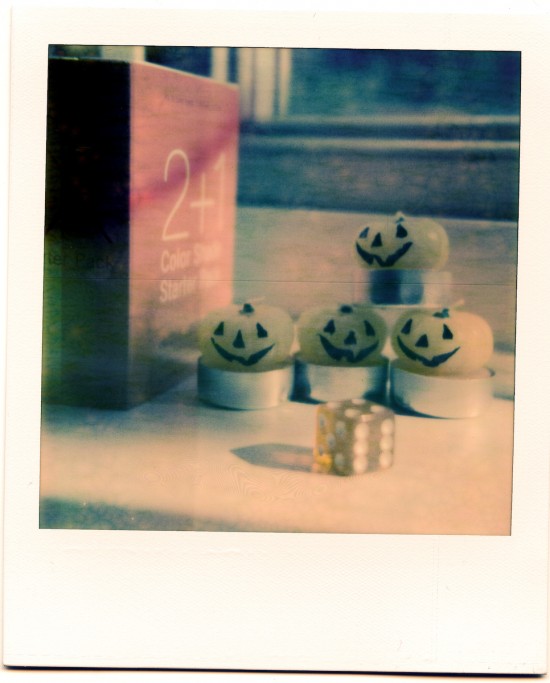
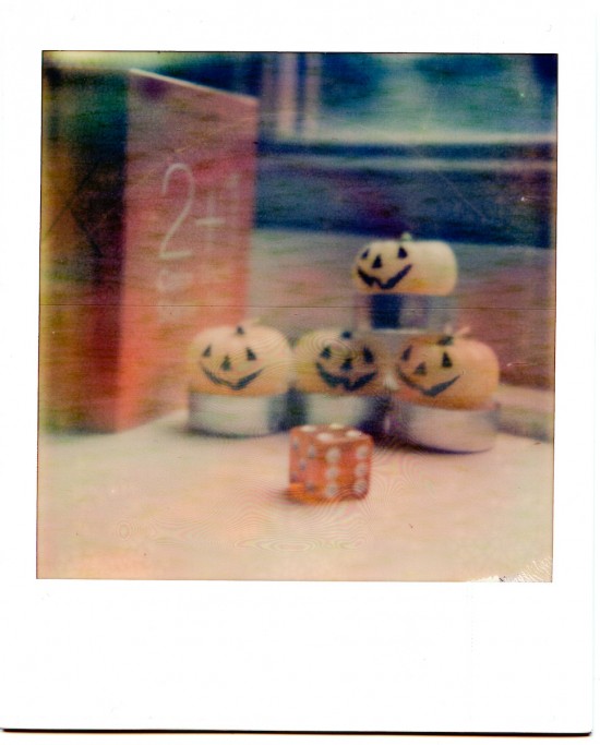
Next I took the same picture again and went over to the freezer to let it develop in there for 5 minutes. PX 600 produces cooler colours when you do that with less rust tones.
PX 70 doesn’t like being frozen and produces a lighter, less contrasty image then at room temperature – the scan doesn’t show that very well though. Colours appear to stay the same.
My Phone vs PX 70
What strikes me is the otherworldly representation of the colours – more so when looking at the actual picture, not so much the scan. Apart from fogging, it’s almost like infrared film which sees more than our eyes.
Hence I took these shots side by side with my phone’s camera (it’s a Nokia N900). This was an indoor shot, well lit, without flash.


Conclusion
My shots are now a few days old, and I’m very happy about the picture stability. It’s a very different ball game than we had with PX 600 First Flush, where pictures kept changing over the next few days. With PX 70 it looks like they’re set in stone after a few hours. Here’s hoping they won’t develop the Killer Crystal, but of course it’s too early to tell yet.
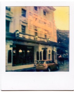
The overall colour rendition reminds me of my previous test with Polaroid TZ Artistic, minus the green tinge. If I look closely, I can see all colours (red, green and blue) – but I have to look really hard. Even in bright sunny conditions colours don’t come out like I would expect.
Contrast is another issue: I can neither find punchy blacks nor brilliant whites in those pictures. It doesn’t seem to make a difference to colours or contrasts if the pictures are taken indoors out outdoors.
Again, this is a very different issue when looking at the scan compared to the actual picture. It depends on what the application and intention of this material is: do we want an instant picture that looks good, or do we want a material that’s rather mild in contrast but in turn offers nice results once it’s scanned and shared on Facebook? Or can we hope for something that does both equally well?
Overall a nice first try which proves that “it can be done”. I’m sure Impossible are hard at work to bring us the next edition, hopefully one that’s not sensitive to light anymore after exposure (because I think we would all like to see those shots come to live upside up).
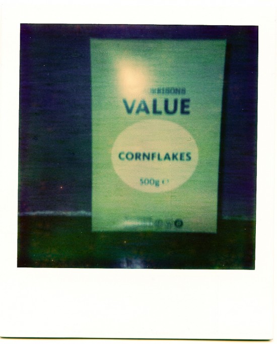
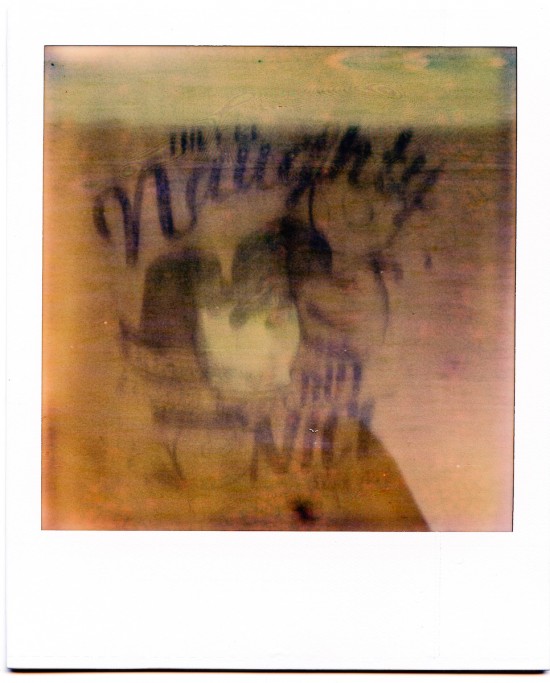
Here are a couple of PX 70 shots I took on my Polaroid Extreme 600 camera:
Stay tuned and happy shooting 😉
Not my work, Jay. I’m told the packaging was designed by Professor Achim Heine of Berlin.
Thanks for clearing that up, Paul. I could have sworn that they are yours 😉
No kidding! I like that smiley you added. “And so it goes,” as my fellow Cape Cod wash ashore was so fond of writing.
That was the late Kurt Vonnegut I was quoting.
Hi, nice article! I was wondering if you could upload the pictures you took with your 600 camera. We recently bought the film and tried it out today, but the pictures are almost completely faded after even 30 minutes.
I know what you mean – the PX 70 film really needs a LOT of light to yield anything resembling colours. 600 cameras are made to use 600 ISO film, but PX 70 only has 125 ISO so that’s nearly two full stops of under exposure. Impossible have a lot of work to do…
I’ve added my 600 shots at the bottom of the post 😉 I didn’t share them to start with for obvious reasons… I thought I had more but I only found two. Maybe I didn’t scan the others due to harsh disappointment…
Happy Shooting!
Thanks! I found this video on how to do them well, and I’ll try that out soon. You might want to check it out
“I’m talking boiling hot coffee you know.” => Thanks mate. Had a good laugh.