ZBrush doesn’t have a User Manual in PDF form you can download and curl up with. Instead, it has an online version over here.
ZBrush also encourages us to use the integrated help which explains every feature of the app. All we have to do is press CTRL / CMD while hovering over an item in its extensive menu.
Trouble is, when I do this on my Mac, I can barely read anything – if at all. You’d expect that an $800 piece of software would at least WORK out of the box without extensive digging into how to make the friggin help show up. But of course that’s not how it works with ZBrush.
Lucky for us the entire UI is customisable (albeit a tad difficult to understand how), and thanks to MentalFrog’s suggestion I could tweak my ZBrush popup help from “totally irrelevant” to “actually usable”. Let me show you how.
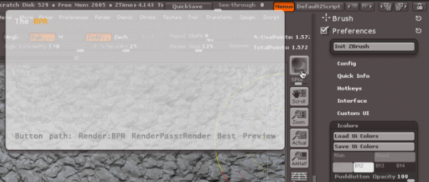
Head over to Preferences – Icolors. Take a look at the 40 billion options you have here. None of them actually tell you which part of the UI they’re changing. Nice job, Pixologic!
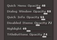
Somewhere towards the bottom of this very long list you’ll see a slider labelled Quick Info Opacity. This will control how opaque the background in the popup help is. 0 is transparent, and 100 (or -100 for that matter) means it turns white by default. Crank it up to something between 60 and 100. This by itself does not help to make the words readable.
Two options further up in this list are labelled Palette1 and Palette2, both of which are set to white by default. Those two make up the background colour of the popup help and other popup menu items.
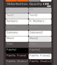
You can set both to the same value, or use different values to create a gradient effect. To make a change, first pick a colour using the regular colour picker on the left hand side of ZBrush. You know, the square within a square type thing. Once chosen, click the relevant Palette box and the colour will be populated.
I know. They made absolutely sure these features are unintuitive. They have a huge department working on how to make things unintuitive at Pixologic. It’s their top priority over there.
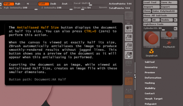
But if you hang in there, you can achieve readable results like this one:
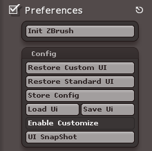
Once changed to your liking, make sure you head over to Preferences – Config – Store Config so that ZBrush will remember your changes. Otherwise it’ll reset to what you had before on your next restart.
And just because I know how things can go, I’ve exported my settings so I can bring them back easily. I’ve changed the default colour scheme from “ultra black” to something that doesn’t burn out my eyes or my monitor. Feel free to use them – I’ve exported both the UI Colors and the Custom UI – just in case:
- ZBrush2014 – from ZBrush 4R6 (Mac)
Many thanks to MentalFrog on the ZBrush Forum for suggesting these tweaks!